Portfolio
This portfolio documents work completed for HCC 629: Fundamentals of Human-Centered Computing at the University of Maryland, Baltimore County. It presents a structured case study applying seven core interaction design principles to a real-world website, following the DEFINE case study format.
Case Study
Interaction Design Evaluation of Toronto Cupcake (torontocupcake.com)
| Dates | February 2025 – March 2025 |
| Role | Writing and Redesigning |
| Team member | Ishika Tarin |
| Tools | Figma, Apple Preview |
| Skills | Heuristic Evaluation Wireframing User Research Interaction Design Analysis |
1. Context & Problem Statement
Toronto Cupcake (torontocupcake.com) is an online bakery and e-commerce platform. Despite being a functional storefront, the is an online bakery and e-commerce site. Despite being a functioning storefront, there are many usability issues on the site that make navigation problematic for users. This case study identifies seven different violations of interaction design guidelines and offers solutions for redesigning these elements based on guidelines provided in Interaction Design by Rogers et al. and The Design of Everyday Things.
2. Design Process
We followed a heuristic evaluation approach: examined the live website, identified principle violations, documented each with annotated screenshots, and produced redesigns using Figma and Apple Preview. Seven issues were found across six principles.
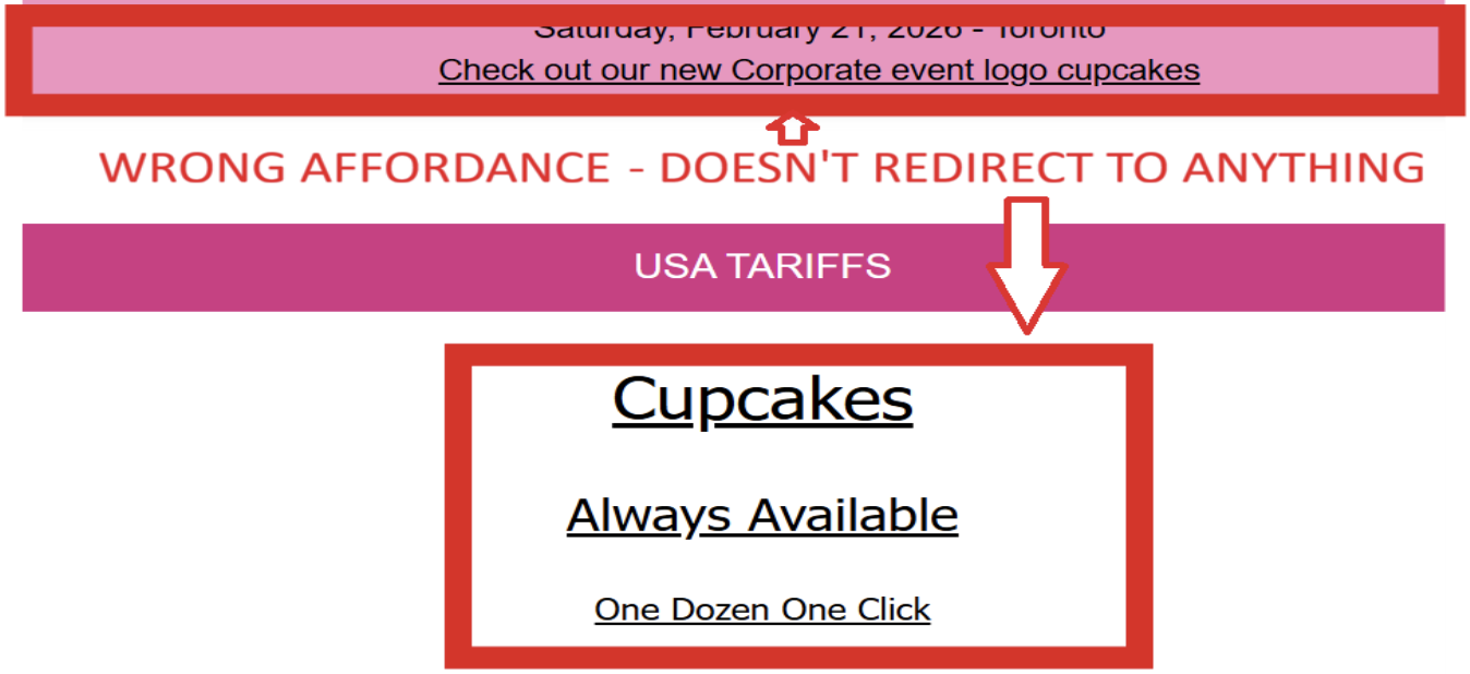
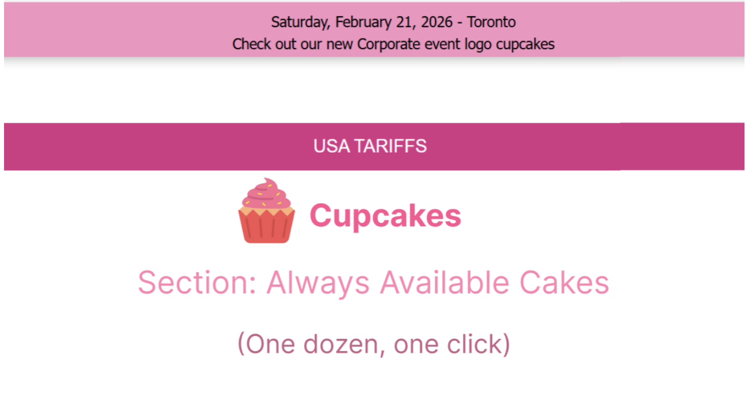
Issue:
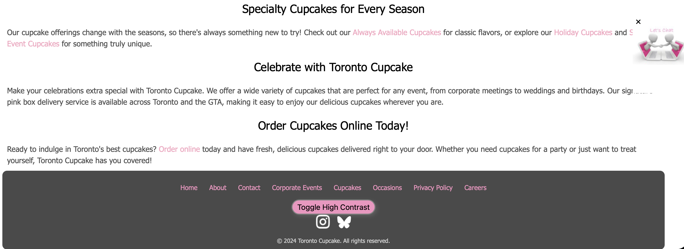
Words such as "Cupcakes" and "Always Available" are underlined on the Toronto Cupcake website, which
implies that these words are clickable. However, these words are not clickable. This
creates confusion for users as they click on these words, which do nothing
(Norman, p. 20).
Redesign:
We removed the underlines from the non-interactive labels and highlighted them in pink instead, which is part of the color scheme of the website.
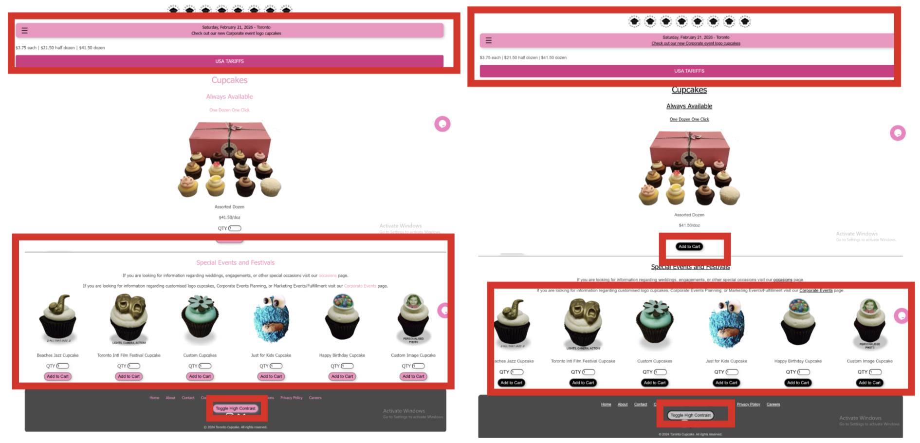
Issue:
The "Toggle High Contrast" button located at the bottom of the Toronto Cupcake page
only controls the contrast of some elements on the page; the navigation
bar and the labels at the top of the page remain unchanged. This is
because the relationship between the control and the expected
consequence on the entire page is inconsistent (Norman, p. 37).
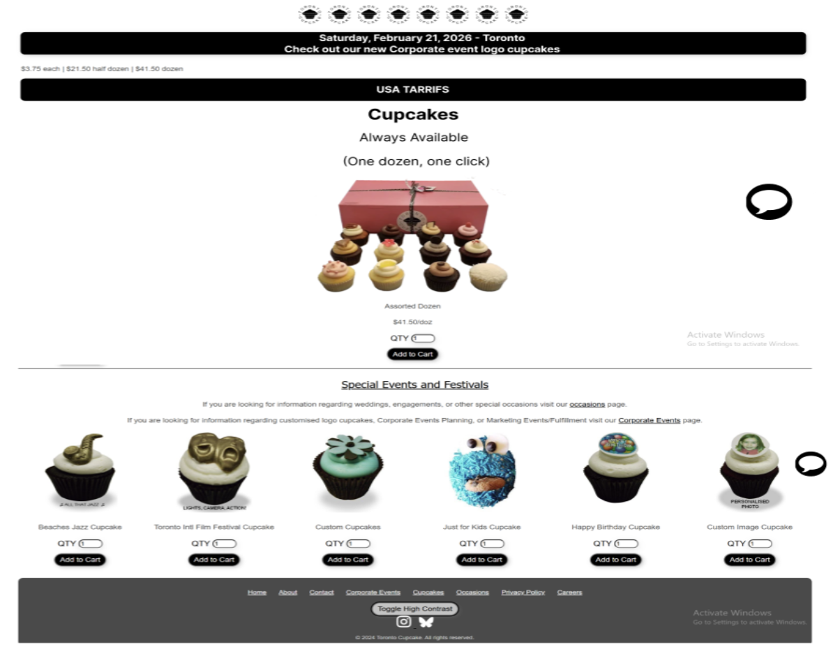
Redesign:
We ensured the toggle applies high contrast to all elements on the page,
establishing a correct and complete mapping between the button's action and
its visual outcome.
Issue:
The "Toggle High Contrast" accessibility button is located at the very bottom of the page, well outside the natural user flow for those who need high contrast. It is not likely to be found by those who need it. Important controls should be where the user expects them, as discussed in Rogers et al., pp. 27-32.
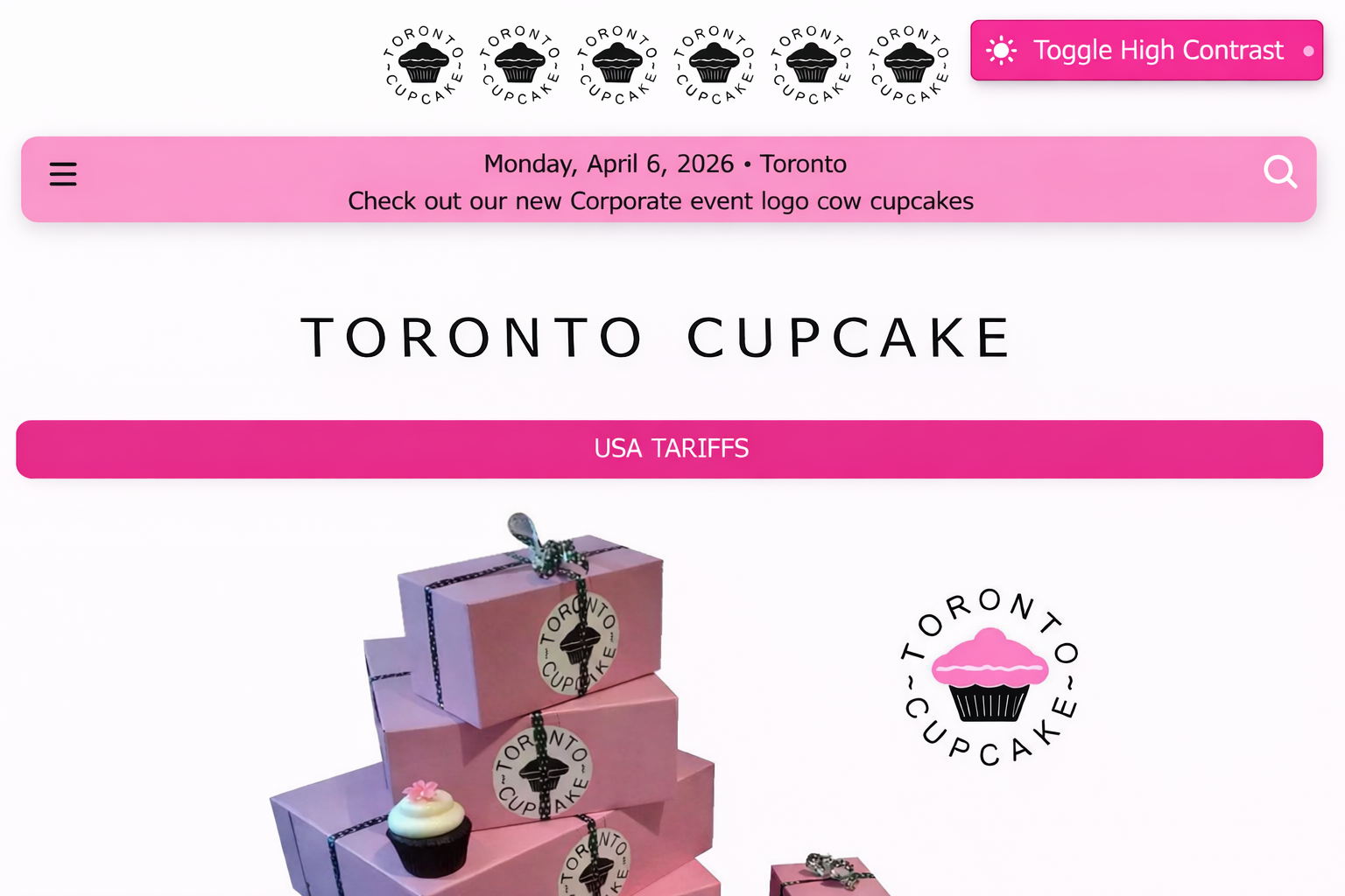
Redesign:
We moved the toggle to the top navigation bar, where accessibility controls
are conventionally expected, making it immediately visible to users who need it.
Issue: When adding an item to the cart, there is no confirmation provided on the site – no notification or change in the cart count. Users are unsure whether their actions have been registered or not, which goes against the feedback principle (Norman, p. 44).
Redesign: We added a brief "Item added to cart!" toast notification and updated the cart icon count immediately on click, giving users clear and timely confirmation that their action succeeded.
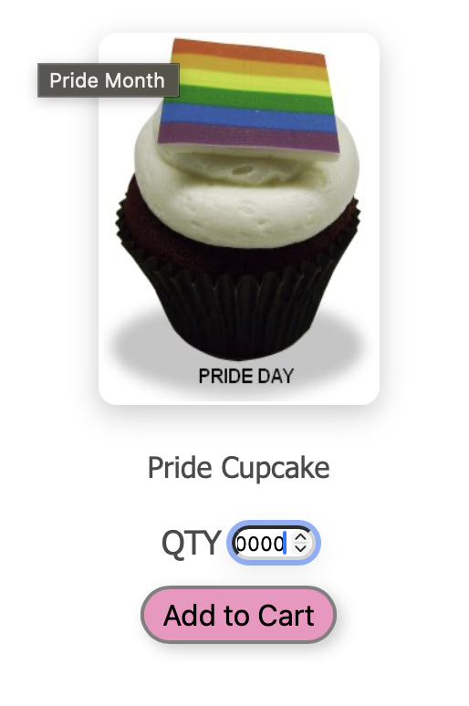
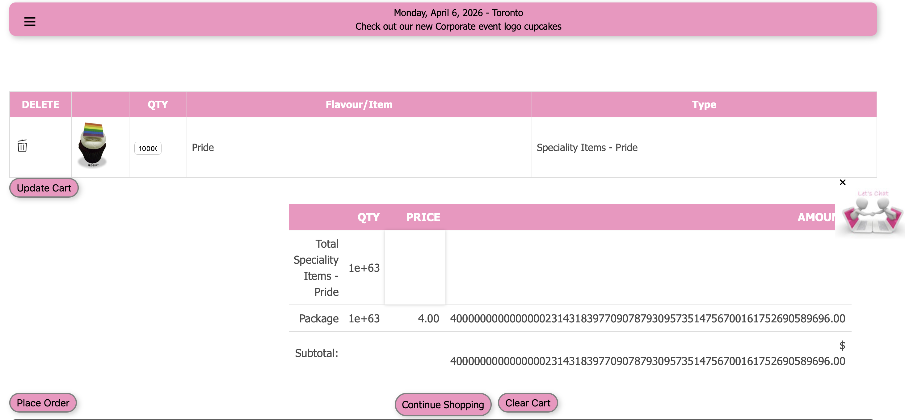
Issue:
When customizing a cupcake, users can enter any value greater than 1 (even 1 trillion!). This can allow invalid orders and creates confusion about what constitutes a valid input (Norman, p. 45).
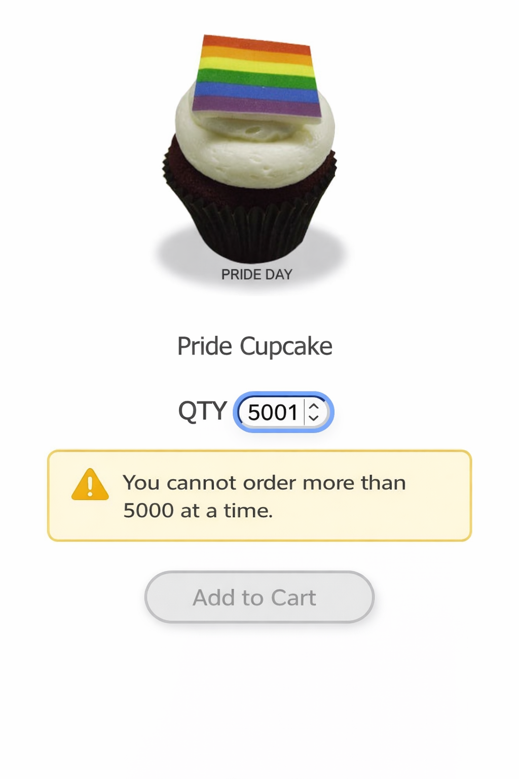
Redesign:
We set a maximum value of 5000 on quantity inputs and disabled the "Add to Cart"
button when the quantity is zero or empty, preventing invalid submissions and
guiding users toward a valid order.
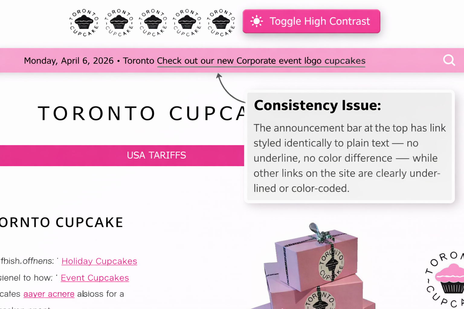
Issue:
The announcement bar at the top of the page contains a link styled identically
to plain text — no underline, no color difference — while other links on the site
are clearly underlined or color-coded. This inconsistency makes the interface
unpredictable (Norman, p. 174).
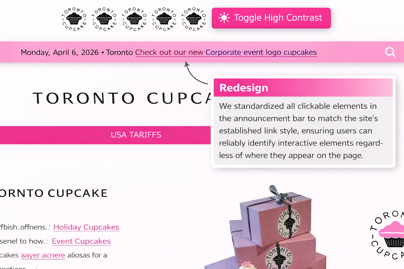
Redesign:
We standardized all clickable elements in the announcement bar to match the
site's established link style, ensuring users can reliably identify interactive
elements regardless of where they appear on the page.
3. Outcome
Seven interaction design violations were identified and redesigned. Each redesign was based upon the underlying reason for the usability issue. Annotated "before" and "after" screen shots were created for each issue. The redesigned changes were shown to enhance learnability, efficiency, and the confidence of users. The high-contrast redesign was also shown to enhance accessibility for users with visual impairments, connecting the design issue with the larger equity issues through the Matrix of Domination.
4. Reflection & Lessons Learned
This project reinforced that interaction design problems are rarely due to a single oversight, but rather a general lack of intentionality within a product. Toronto Cupcake is a functioning storefront, but many of their usability issues were at a fundamental level: affordance, mapping, and signifier issues.
I learned how important it is to look at a design behaviorally, not just aesthetically. To consider not just whether or not it looks correct, but whether or not the user understands what to do next, and what just happened after they took action. Working in a partnership (with Ishika Tarin) also taught me how different people will notice different issues within a product, reinforcing the importance of a collaborative heuristic evaluation as opposed to individual evaluation.
This project would greatly benefit from usability testing if continued to determine whether or not these changes are actually effective in improving user completion rates and reducing errors.